
Role 1: UX Designer
Tools: Figma
Problem:
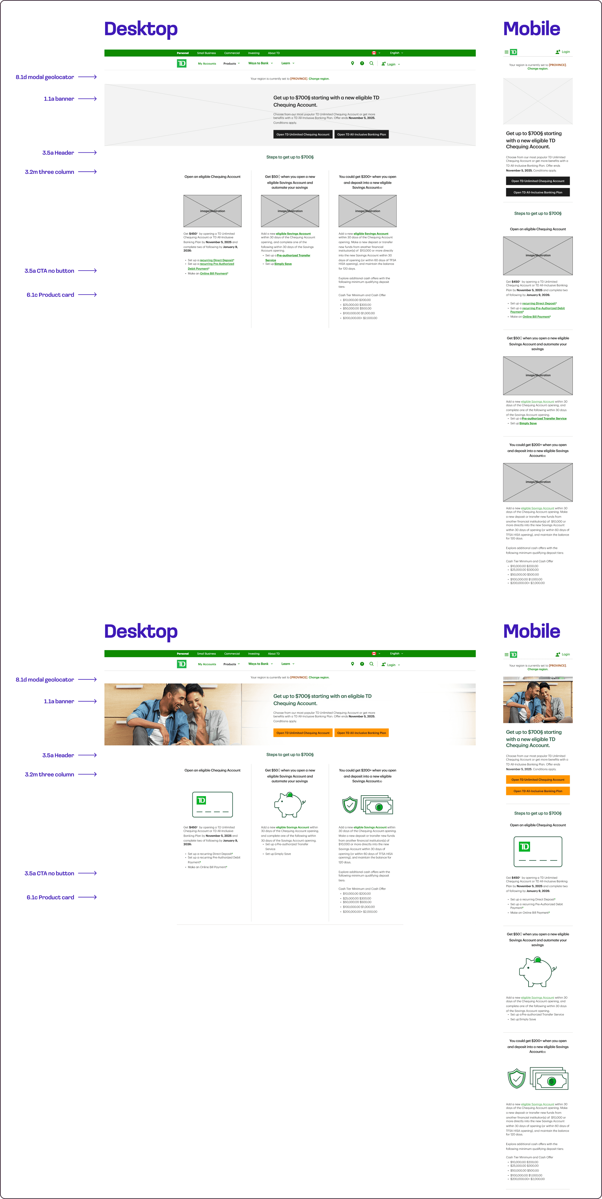
Creation of guide templates with the final responsive visual design.
Challenge:
Give the mock-up a high-fidelity finish and check that the components proposed in the wireframe are consistent with the final version for the hand-off.
Case example:
As part of the example below, the different components that make up the content of the template are shown in the two states of visual development: wireframing and high-fidelity (my role).
Role 2: UX/UI Designer
Tools: Figma
Problem:
Need to update and optimize the component library, according to the following points:
1. Unable to use the latest components. Due to one of the bank’s Figma library size, we haven’t been able to include the latest components in this library. This includes even component variants & component recipes.
2. Theme-ing takes time. Building themes into a component still needed to be done manually through component variants.
3. Missing data. With the inability to add the latest components to the library due to file size, we are missing data on how many teams these components get used.
4. More components coming. As the team keeps contributing to the library, such as with component recipes, keeping the file size down becomes harder to manage.
5. Less available. Should we have a new brand direction, or even a Visual ID update, it would take a lot of time to apply the required changes across all manual theme creations.
Challenge:
By implementing variables, this helps:
1. Reduce library weight. It simplifies component weight, by reducing the number of variants needed. It also allows us to include the new components & others that are coming down the roadmap.
2. Enabling easier updates to global design changes. New Visual ID changes such as colour & typography can be implemented faster.
3. Reduced time spent on repetitive tasks & manual updates. By identifying these variables up front, we’re able to shift between different themes more easily.
4. With time saved, it would also allow designers to focus more on creative problem-solving opportunities.
Development plan
Week 1
Week 8
Week 18
Library 1
Library 2
Library 3
Launch
Variable breakdown
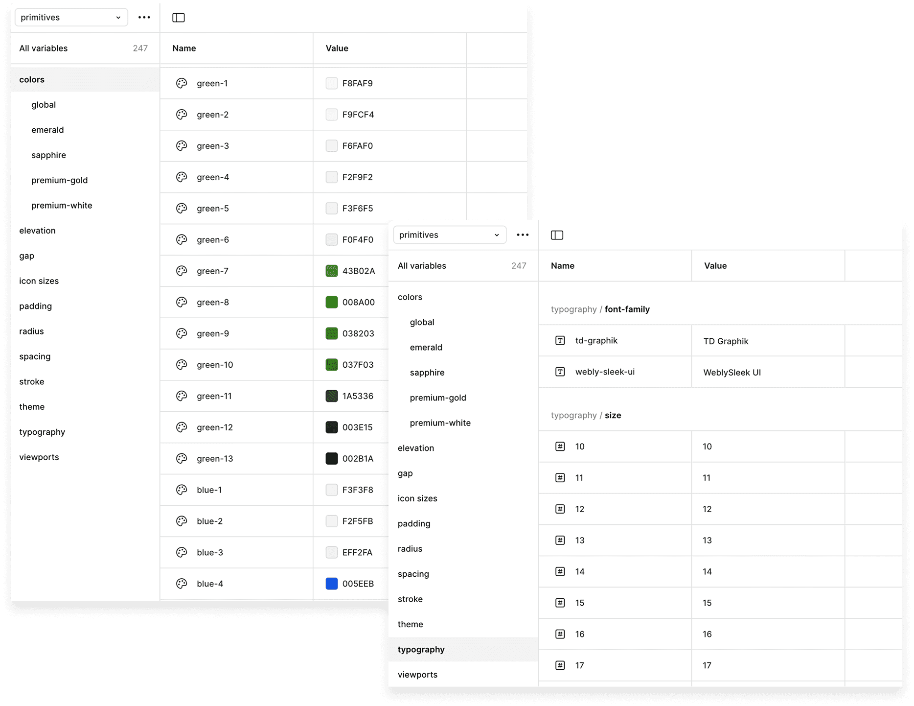
Currently, the selected bank’s library is composed of three different libraries. To optimize and unify the library, we mapped all global values from these libraries and identified key variables: colors, spacing, theme, typography, viewports, radius, stroke, gaps, paddings, elevations, icons, and borders.
Mapping & organization
After mapping all global values, we organized them into token categories, assigning each value to its specific theme. This helped standardize how styles are applied across components and themes.
Token structure:
1. Primitive tokens: These establish the foundational values applied across all semantic and component tokens.
2. Semantic tokens: They create a consisten visual language adaptable across multiple themes.
3. Component tokens: To keep flexibility at component level while maintaining consistency, through shared variables

Results
1. New comparison of components
Previously, the version of each theme was available for all breakpoints; now, only the breakpoints are available, and themes are swapped from the appearance panel.

2. Library size
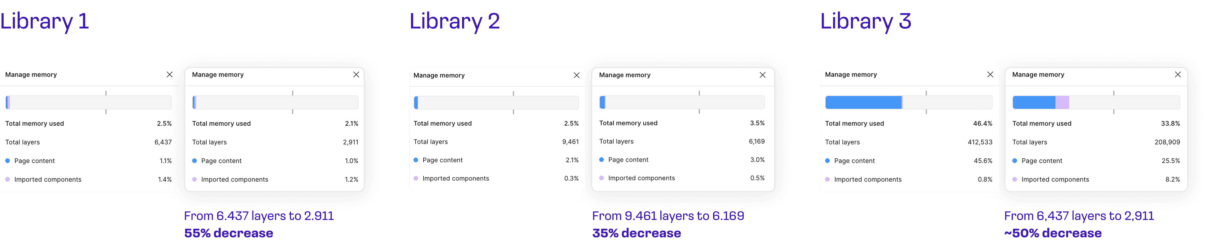
The three libraries significantly reduced their memory usage and the number of layers in each of them.
Role 3: UX/UI Designer
Tools: Figma
Problem:
The investment side of the bank needs to feel modern, confident, and human — which is how they want their customers to experience them.
Challenge:
Elevate the brand experience site with a design refresh.
Three key enhancements in the public site refresh
1. Contrast
Contrast plays a key role in the new art direction of the project. Through use of different type sizes and weights, we have clarified the hierarchy of the page and emphasized the message of each component. We are also able to condense copy into a couple of lines — driving home the main message so users are likely to scan rather than read.

2. Colors and visual assets
We incorporated the new color palette and illustration style to truly bring out the spirit of the redesign. They’re the key connection of the public site to the App redesign, serving as a seamless pathway from our platform to the next. Using human-centered imagery will help build relatability and strengthen emotional connection with our targeted audience.

3. White space
Strategically, placing white space (negative space) throughout the layout, we aimed to improve readability in order to help customers scan faster and reduce friction in decision-making.
Results
1. Optimized redesign of the entire site

2. Library and component creation
A new design kit was created for the project, aligned with the existing visual style of the bank’s app. Variables were implemented to switch between low-fidelity (wireframes) and high-fidelity versions of the components.


