
UX
UI
Prototype
Web app
Role: UX Research, UX/UI Designer
Tools: Figma, Adobe CC
Problem:
San José’s First Baptist Church community makes use of digital tools for its administration, among the files that are managed, there is didactic material. They need to systematize the dissemination of teaching material through the design of a platform.
Challenge:
Organize existing information and develop, based on evidence, a user experience that meets the needs of the population.

Development plan:

Case 1: Provide teaching material
The material is led by a volunteer and they usually share the resources according to whoever has them.
The lack of a repository that establishes as root to provide these documents is identified, which leads to a risk of loss, and therefore, the loss of the resources.
Case 2: Training activities
The person who will accompany the interested party must be determined, the material is delegated, and it is up to the interested party and the tutor to coordinate the way in which they will carry out the course, whether in person or online.
It is identified that there are no asynchronous options, which is a delay for those who want to carry out the course, since they depend on a person in charge accompanying them.
Assumptions & requirements
An interview was conducted with stakeholders, from which the following requirements were extracted and grouped into the categories shown below.
User profile
User type
Record
Access
Pending tasks
Courses
Take or free modules
Course completion status
Library
Digital resources
Documents to download
Search
Information sourced from course/resources
Use of keywords
Notifications
Updates to be made known before they occur
Reminders regarding the status of a specific course/activity
Benchmarking
The analysis was done on platforms focused on course management, ranging from educational institutions to corporate training tools. With this analysis the design patterns are concluded.


User types
Three types of users were identified in this project, the front-end shown is that of the student user.

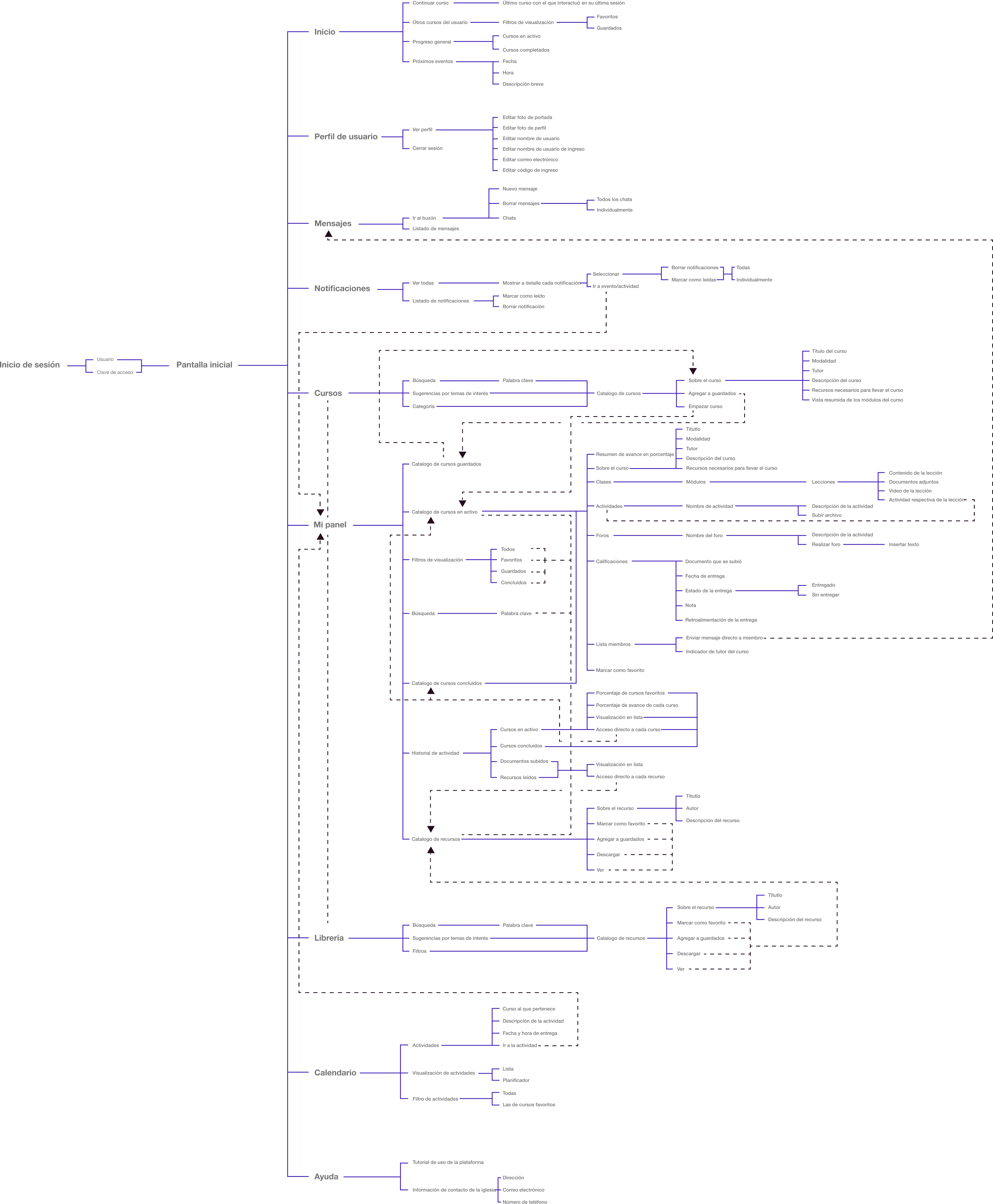
Beta architecture
The different users and their needs are analyzed to map the platform’s content. Although the front-end shown is that of the student, the refined architecture is shown below.
Wireframing
Low-fidelity wireframes in different shades of grey to focus the testers on the structure and not on the visual appeal.


Try here the prototype


